

Today and tomorrow are the days we’ve all been waiting for. The College Board released its new concordance tables between the old and new SAT. Tomorrow the first set of scores come out for students who took the SAT in March.
What did the College Board release today?
The College Board released two important tools today.
Score Converter App: The College Board has built a very handy app that anyone can download for free (iOS and Android compatible). You can enter either old or new SAT scores, and it will instantly convert the scores to the old or new form. Once you convert them, you also have the option at the bottom of the screen to find out the comparable ACT score. This app is a must for students, parents, counselors, teachers, and test professionals. It’s very easy to use and displays all the data you need in an easy-to-read way. Check it out here
Conversion Charts: The College Board also released a series of multi-page booklets showing all of the possible score conversions. It includes tables for converting total SAT scores, section scores, and test subscores, as well as comparing ACT and SAT. These documents are meant primarily for college admissions departments as they grapple with how to update their systems to analyze applications. Counselors and test prep professionals will also find them helpful. These are a bit harder to use and are much more complex than the app, but provide the same information just in a different format. Check it out here
How can I use the new tools?
First, you can use the new data to move between the two tests. If you took both the old and new SAT, the tools will help you figure out which test you did better on.
Second, if you decide to take the new test and aren’t sure how your new SAT score compares to the admissions standards of your target colleges, you can use this data to help. In the app, you can plug in the college’s old average SAT score and convert that average to the new score. Then compare that new average to your score report. For example, at Emory University the average old SAT score ranged from 2020–2260. If you pop that into the new College Board app, that would mean the new average SAT score at Emory would probably range between 1420–1540, so you’d likely want to shoot for a new SAT score in that range.
Third, you can now decide which test you do better on: the ACT or the SAT. The new SAT/ACT comparison tables are the first of their kind. They clearly tell you what scores are comparable on the SAT and ACT exams. For example, a 1380 total score on the new SAT is the same as a 29 composite on the ACT. If you took a diagnostic exam and found that you scored higher than a 29 on the ACT, it’s a good indication the ACT is a better test for you. It’s important to note that the ACT did not take part in building this comparison chart. As such, the SAT was not able to create comparisons charts for each section of the tests and the ACT may eventually come out with its own chart or refute the SAT’s table.
What didn't the College Board release?
One of the biggest missing pieces today was a percentile chart. When the PSAT concordance tables came out in January, the College Board also released a chart showing each score’s percentile. (As a reminder: Percentiles tell students how well they did in comparison to other test takers. For example, a student with a score in the 80th percentile did better than 80 percent of all the students who took the test.) But this time they are missing.
The big question is: Why? It’s possible—but highly unlikely—that the College Board didn’t bother to do percentiles. Percentiles are how test writers create concordance tables like the ones the College Board released today. It’s also how the SAT and ACT in the past have created the SAT/ACT comparison charts. It would be nearly impossible to imagine that they don’t have them.
So why might they be missing? Perhaps the College Board plans to release them soon. The College Board reps sent out a lot of data today, and they might just be backed up. Another reason might be they aren’t 100% confident in the percentiles, which could cast doubt on these early conversion charts. A final reason is that the response to the percentiles released after the PSAT were pretty harsh. Experts and the media noticed a surprising amount of inflation in the percentiles and heavily questioned the College Board’s new numbers. (See our own critique here) The College Board was thrown on the defensive on what it hoped would be its first successful data rollout. It’s likely the College Board wants to avoid the same criticism here.
What does the new data reveal?
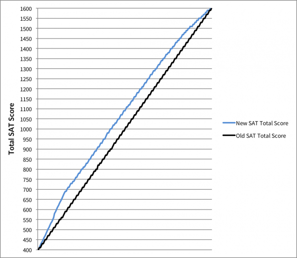
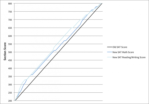
The biggest revelation is that scores are rising on the new SAT. On average for Math, a new SAT Math score is 30 points higher than its comparable old SAT Math score. For example, an old 700 in Math is the same as a 730 on the new SAT Math. For Reading/Writing the inflation is even bigger, coming in on average at 40 points. For example, earning a 690 on both the Reading and Writing sections of the old SAT is the same as getting a 730 on the combined Reading/Writing section on the new SAT.
Below are two graphs that show this inflation, one looks at the each section individually and the other looks at total scores on the test. For each chart, the black line represents the old SAT. The colored lines represent how much higher the new SAT scores are in comparison.
Total Scores Comparison
Section Scores Comparison
Why does this matter? This change likely means that the average scores needed to get into your target universities will go up since everyone’s scores are going up on the new SAT.
Why is this happening? There are a number of likely reasons, but the College Board has not explained the trend. It could be happening because there is no more guessing penalty and because there are now only four answers instead of five to pick from on every question. These changes mean students get more questions right by sheer luck. It also could be an effect of changing the score system: taking the essay out of the total score and collapsing Reading and Writing into one. These adjustments could explain the inflation in the Reading/Writing score but doesn’t explain the change in Math. It’s also possible that the College Board is playing it safe and intentionally inflating some of the scores to appease students and parents worried about the transition to the new SAT. Either way, it’s hard to deny that inflation is happening and will affect the coming testing season.
As scores continue to roll out this spring, ArborBridge will keep a close eye on the trends and update you as the College Board releases more material.


